The web interface
February 2016
![]()
A thin digital surface between the exhibit and the social media.
From the beginning of the project we thought that the Sardegna Regional participation at Expo 2015 needed to have a relevant space in the domain of digital media.
In our vision, the event was not just taking place in Milan: in a way it needed to be 'happening' everywhere. This starting decision played an important role in the design of the communication strategy, impacting the design of the exhibit and of its contents.
A first point is the context of an International event like the Expo; where visitors are exposed to an enormous amount of stimuli, We understood we could only rely on a very short span of attention. Even in the best case scenario, we would have been able to light up just a little bit of curiosity towards Sardinia, with no opportunity to fulfill any demand for detailed information. We then decided to focus on an introductory invitation to the discovery of Sardinia.
Secondly, we wanted to allow people who weren't planning to travel to Milan or to Sardinia to be somehow part of the event. The digital part of the project was intended as an alternative to the visit and, at the same time, as an extension of the exhibit itself.
Thirdly, we needed to present the calendar of events related with the Expo, to let everybody know what was going on day by day, allowing people to plan their visit.
Finally, we were interested in gathering the feedback and the emotional reaction from those who already had visited or participated to the event. We planned the use of digital media as a way to create a positive ambience of expectation around the Expo.

A digital interface
From the early stages of the project, the web platform we started developing took the nickname “sandwich”.
The idea behind it was of something thin, useful and tasty, placed in-between two different realities: the physical installations in Milan and the web-based representation of Sardinia, sorted according to four key-words: environmental and food quality, active longevity and sustainable innovation.
We thought that most of the content was already on-line. Instead of creating “ad hoc” content, an effort was made in order to redirect users towards the appropriate sources of information.
At the same time we wanted to have a subject with a clear and recognizable identity able to focus social media activities during the event.

Production
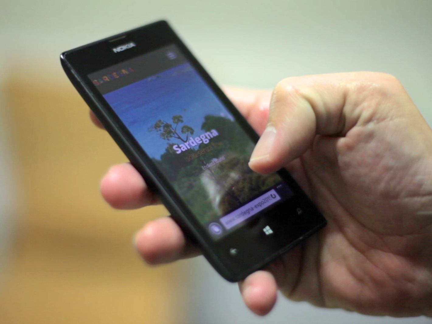
The web site is on line at sardegna-expo2015.it. Most of the contents are available from the home page, organized on a long “one-page-site” scroll, in a mosaic layout, according to the general corporate design guidelines. These guidelines have been readily adapted for the digital context, keeping the geometric illustrations in the heading of every section ad adopting the “Báttoro” type-face for titles and capital letters.
The result is a nimble responsive site, tailored for smartphones and tablets, the devices used in 31% and 6,5% of the monitored visits.
Today, we like to think of it as a digital record of this recent event, hoping that some of the guidelines used in this project may be considered as “good practice” for further initiatives.
Alfredo Calosci
Communication Designer
An Architect by training, Alfredo has been teaching in our Department form the start of our Design program, and has a wide design teaching experience at an international level. A professional and consultant in the area of web and interaction design, Alfredo has played da key role in all our main recent projects, such as the Informanimation Erasmus IP and the 2CO Communicating Complexity International Design Conference.